Let’s get to the core of the Swanson paper and start
talking about correlations.
“Correlation is not causation”. How often have we seen this mantra on pro-GMO websites! It’s as if they only have to say the magic words and they win the argument. The picture is reinforced by graphs like this:
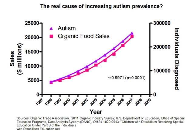
You may recognize this meme, it’s been floating
around on pro-GMO websites for quite a while.
It’s kind of fun because it’s so ridiculous—calculated to really piss
off organic food fans. And the intended
take-home message is that correlations are pretty well valueless. To counter that, I’ve deliberately entitled
this post “Causation IS Correlation”.
How can that be?
If I say “Bob is not Bill” and “Bill is Bob”, haven’t I contradicted myself
(unless I’ve cheated by bringing in a different Bill and/or a different Bob)? Sure, but talking about individuals is very
different from talking about sets. To cover
all possibilities, consider two circles, one containing the set of possible
causes for a given phenomenon, the other the set of the things that correlate
with that phenomenon:

A: Correlations Causes

B: Correlations Causes

C: Correlations/
Causes
1. Plausibility: A plausible mechanism between cause and effect. (OK for Swanson: glyphosate has known toxicity. Not OK for organic food sales or organic food consumption--what do you suppose everyone was eating a couple of hundred years ago?)
A: Correlations Causes
B: Correlations Causes
C: Correlations/
Causes
For
any phenomenon X (say autism) there will be both correlating-causative and correlating-noncausative factors. In the A diagram (valid only for Bill-and-Bob
cases) causes and correlations are entirely separate, have nothing whatsoever
to do with one another. This is the
picture that I’m sure GMO supporters would like to leave you with. In the B diagram, correlations and causes
overlap, so that autism might fall into the overlapping area (where its cause(s)
is/are) or outside it, where organic food-sales lie. GMO supporters wouldn’t mind you leaving with
this picture, either.
But
the only diagram that fits reality where sets are involved is diagram C, where
the circle containing sets of posible causes is entirely enclosed by the circle containing sets of correlations. What this means is that, for any given phenomenon,
there may be correlations that are not really causes, but whatever the
cause is, there will be accompanying correlation(s). So “correlation is not causation” is only a
half-truth. The other half is the title
of this post. Wherever there is a cause
there will be a correlation, so correlations form an invaluable tool for shrinking
the search space in which the true causes for any phenomenon will be found. That's why pretty well all sciences use correlations at one time or another--especially when true causes are not readily apparent. And it's not readily apparent why the U.S., a country that prides itself on having the world's most advanced medicine, should have so many diseases that are getting steadily worse
Nobody,
least of all Swanson et al., is saying that correlation proves causation.
Here’s
all that that paper claims: “The significance and strength of the correlations
show that the effects of glyphosate and GE crops on human health should be
further investigated.” No more than that. The only thing you might question is whether
the correlations are strong enough and significant enough to warrant such
investigation.
How
do you test for strength and significance?
First the strength of a correlation; according to Wikipedia, “There are
several correlation coefficients,
often denoted ρ or r, measuring the degree of correlation. The
most common of these is the Pearson correlation
coefficient.” This, then, is a
natural choice for Swanson et al. Once
you arrive at a coefficient, its strength can be measured by its closeness to
the ideal: +1.0. This is to some extent
context-dependent—as Wikipedia points out, “A correlation of 0.8 may be very
low if one is verifying a physical law using high-quality instruments, but may
be regarded as very high in the social sciences where there may be a greater
contribution from complicating factors.”
The causes of things like autism or cancer obviously come somewhere
between these, so the fact that at least twelve of the Swanson correlations
between a negative health condition and GE crop/glyphosate use are higher than
0.95 should be enough to disturb anyone.
But
there’s still the issue of significance.
After all, autism/organic-food-sales yielded a 0.99 correlation. However, purveyors of the GMO jokegraph
conveniently forgot about the Bradford Hill criteria. There are eight of them, of which the most
relevant in this case are:
1. Plausibility: A plausible mechanism between cause and effect. (OK for Swanson: glyphosate has known toxicity. Not OK for organic food sales or organic food consumption--what do you suppose everyone was eating a couple of hundred years ago?)
2. Coherence:
Coherence between epidemiological and laboratory findings increases the
likelihood of an effect (there are plenty of laboratory findings for glyphosate
damage if you care to look for them—note that most if not all of the papers
that give glyphosate a clean bill of health evince no awareness of the facts provided
in “Unsafe at Any Dose?”. But there are no lab findings that organic food
damages your health.)
Even
if all eight criteria are satisfied, as Bradford Hill points out, that still
doesn’t amount to proof until the mechanism causing the effect has been indisputably
demonstrated. But correlations as strong
and as significant as those the Swanson paper points out demand further and
deeper investigation. Adding to their
significance is the fact that these correlations involve not just one or two
conditions but nearly two dozen. One or
two might be chance, but two dozen? Come
on!
There
is at least one further consideration that must be taken into account if we are
to properly evaluate the significance of this particular smoking gun. It involves cancer.
The
National Cancer Institute’s Cancer Trends Progress Report (2011-12) at http://progressreport.cancer.gov/trends-glance.asp
(apparently the most recent available) shows that while overall cancer incidence
rates are falling, the rate for eleven cancer types is rising. Swanson et al. cover five of those types—pancreatic,
thyroid, kidney, liver, and myeloid leukemia--while their sixth, bladder
cancer, is not separately listed in the Report.
Why are these cancers bucking the trend?
Nobody knows. “The causes
of pancreatic cancer are
mysterious. Although certain risk factors have been identified, the story is
far from complete” (WebMD). “We don't
know what causes thyroid cancer”
(Cancer Research U.K.) “It’s not
clear what causes most cases of liver cancer” (Mayo Clinic). “Doctors don't know the causes of kidney cancer” (WebMD). “We
don't know exactly what causes bladder
cancer” (Cancer Research U.K.)
Now
for the big question: what do the pancreas, the thyroid gland, the liver, the
kidneys, and the bladder have in common?
Answer: all but one are directly involved in metabolism, the process by
which your body converts what you eat and drink into energy, while that one, the
thyroid, regulates the energy thus produced.
We can therefore conclude that
whatever is driving the increase in incidence can only be something in the
environment that we ingest, that appeared relatively recently, and that is
increasing in use. Apart from pesticides
and foods made with GMOs, how many other things can you think of that meet all
these criteria?
Finally, please note the green trend lines in some of Swanson et al.'s figures (#s 7, 10 through 15, 24 and 26, for those of you who have the paper to hand). Nobody is claiming glyphosate or GMOs as the sole cause of the selected diseases, nobody is even claiming that either of these is the sole cause for recent increases in their incidence. For several of the conditions described, numbers were already increasing from 1980 or even earlier. What the green trend lines show is the incidence that would have been predicted if no additional cause(s) had emerged after 1990. But in all nine of these figures, the actual incidence is far higher than the predicted incidence. These trend lines not only show that some new factor(s) must be present, but they pinpoint the exact time that incidence started to rise faster than the trend--the same time for each of the nine conditions, which just happens to be the year in which large-scale spraying and consumption of GMO foods really took off.
Finally, please note the green trend lines in some of Swanson et al.'s figures (#s 7, 10 through 15, 24 and 26, for those of you who have the paper to hand). Nobody is claiming glyphosate or GMOs as the sole cause of the selected diseases, nobody is even claiming that either of these is the sole cause for recent increases in their incidence. For several of the conditions described, numbers were already increasing from 1980 or even earlier. What the green trend lines show is the incidence that would have been predicted if no additional cause(s) had emerged after 1990. But in all nine of these figures, the actual incidence is far higher than the predicted incidence. These trend lines not only show that some new factor(s) must be present, but they pinpoint the exact time that incidence started to rise faster than the trend--the same time for each of the nine conditions, which just happens to be the year in which large-scale spraying and consumption of GMO foods really took off.
I
need go no further. If the Swanson et al.
paper is right, the health of millions of Americans is at stake. On the one hand is all the empirical evidence
that they have collected; on the other there are only repeated assurances that
GMOs and pesticides are safe, flying in the face of a fact that to the best of
my knowledge no GMO advocate has even tried to dispute—the fact that, as I described
in “Unsafe at Any Dose?”, we can no longer trust the “safe-dose levels” on
which those assurances are based. The
contentions of this paper MUST be investigated and they must be investigated
NOW!